


写简单优雅的 Media Queries!
Media Queries 中的 min-width 和 max-width 等属性非常容易混淆,每次看到他们,我都想哭。现在新的规范中,可以使用更加直观的 >=或<= 替代 media queries 中的 min-/max- 前缀。
V2.1.0 开始支持 > 或 < 符号。
这是一个实现 CSS Media Queries Level 4 Polyfill 的插件,让你现在就可以使用这些特性,妈妈再也不用担心我记不住了,鹅妹子嘤!

$ npm install postcss-media-minmax
示例 1:
```js var fs = require('fs') var postcss = require('postcss') var minmax = require('postcss-media-minmax')
var css = fs.readFileSync('input.css', 'utf8')
var output = postcss() .use(minmax()) .process(css) .css
console.log('\n====>Output CSS:\n', output)
```
或者只需:
js
var output = postcss(minmax())
  .process(css)
  .css
input.css:
css
@media screen and (width >= 500px) and (width <= 1200px) {
  .bar {
    display: block;
  }
}
你将得到:
css
@media screen and (min-width: 500px) and (max-width: 1200px) {
  .bar {
    display: block;
  }
}
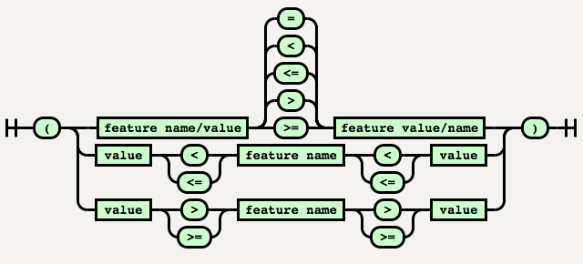
<mf-range> = <mf-name> [ '<' | '>' ]? '='? <mf-value>
           | <mf-value> [ '<' | '>' ]? '='? <mf-name>
           | <mf-value> '<' '='? <mf-name> '<' '='? <mf-value>
           | <mf-value> '>' '='? <mf-name> '>' '='? <mf-value>
PostCSS Media Minmax 目前并没有实现 200px >= width 或者 200px <= width 这样的语法,因为这样的语法可读性并不不是太好。
The special values:
```css @media screen and (device-aspect-ratio: 16 / 9) { / rules / }
/ equivalent to / @media screen and (device-aspect-ratio: 16/9) { / rules / } ```
```css @media screen and (grid: -0) { / rules / }
/ equivalent to / @media screen and (grid: 0) { / rules / } ```
示例 1中同一个 Media features name 同时存在 >= 和 <= 时,可以简写为:
css
@media screen and (500px <= width <= 1200px) {
  .bar {
    display: block;
  }
}
/* 或者 */
@media screen and (1200px >= width >= 500px) {
  .bar {
    display: block;
  }
}
都会得到一样的输出结果:
css
@media screen and (min-width: 500px) and (max-width: 1200px) {
  .bar {
    display: block;
  }
}
注意:当 Media features name 在中间的时候,一定要保证两个 <= 或 >= 的方向一致,否则不会转换。
例如在下面的示例中,width 大于等于 500px 同时又大于等于 1200px,这在语法和逻辑上都是错误的。
css
@media screen and (1200px <= width >= 500px) {
  .bar {
    display: block;
  }
}
规范中目前以下属性支持 min-/max 前缀,PostCSS Media Minmax 全部支持自动转换。
widthheightdevice-widthdevice-heightaspect-ratiodevice-aspect-ratiocolorcolor-indexmonochromeresolution@custom-media 中使用 & Node Watch```js var fs = require('fs') var chokidar = require('chokidar') var postcss = require('postcss') var minmax = require('postcss-media-minmax') var customMedia = require('postcss-custom-media')
var src = 'input.css'
console.info('Watching…\nModify the input.css and save.')
chokidar.watch(src, { ignored: /[\/\]./, persistent: true }).on('all', function(event, path, stats) { var css = fs.readFileSync(src, 'utf8') var output = postcss() .use(customMedia()) .use(minmax()) .process(css) .css; fs.writeFileSync('output.css', output) })
```
input.css:
```css @custom-media --foo (width >= 20em) and (width <= 50em); @custom-media --bar (height >= 300px) and (height <= 600px);
@media (--foo) and (--bar) {
} ```
output.css:
```css @media (min-width: 20em) and (max-width: 50em) and (min-height: 300px) and (max-height: 600px) {
} ```
```js module.exports = function(grunt) { grunt.initConfig({ pkg: grunt.file.readJSON('package.json'), postcss: { options: { processors: [ require('autoprefixer-core')({ browsers: ['> 0%'] }).postcss, //Other plugin require('postcss-media-minmax')(), ] }, dist: { src: ['src/*.css'], dest: 'build/grunt.css' } } });
grunt.loadNpmTasks('grunt-contrib-uglify'); grunt.loadNpmTasks('grunt-postcss');
grunt.registerTask('default', ['postcss']); } ```
```js var gulp = require('gulp'); var rename = require('gulp-rename'); var postcss = require('gulp-postcss'); var selector = require('postcss-media-minmax') var autoprefixer = require('autoprefixer-core')
gulp.task('default', function () { var processors = [ autoprefixer({ browsers: ['> 0%'] }), //Other plugin minmax() ]; gulp.src('src/.css') .pipe(postcss(processors)) .pipe(rename('gulp.css')) .pipe(gulp.dest('build')) }); gulp.watch('src/.css', ['default']); ```
$ git clone https://github.com/postcss/postcss-media-minmaxs.git
$ git checkout -b patch
$ npm install
$ npm test